
Hey y’all — if you’ve been on Pinterest or scrolling design accounts lately, you’ve probably noticed something: this fall isn’t going to look like last fall. Or the fall before that.
For a few years now, fall decor has leaned soft and neutral — creams, warm whites, a little terracotta if you were feeling bold. Pretty, but let’s be honest, a little safe.
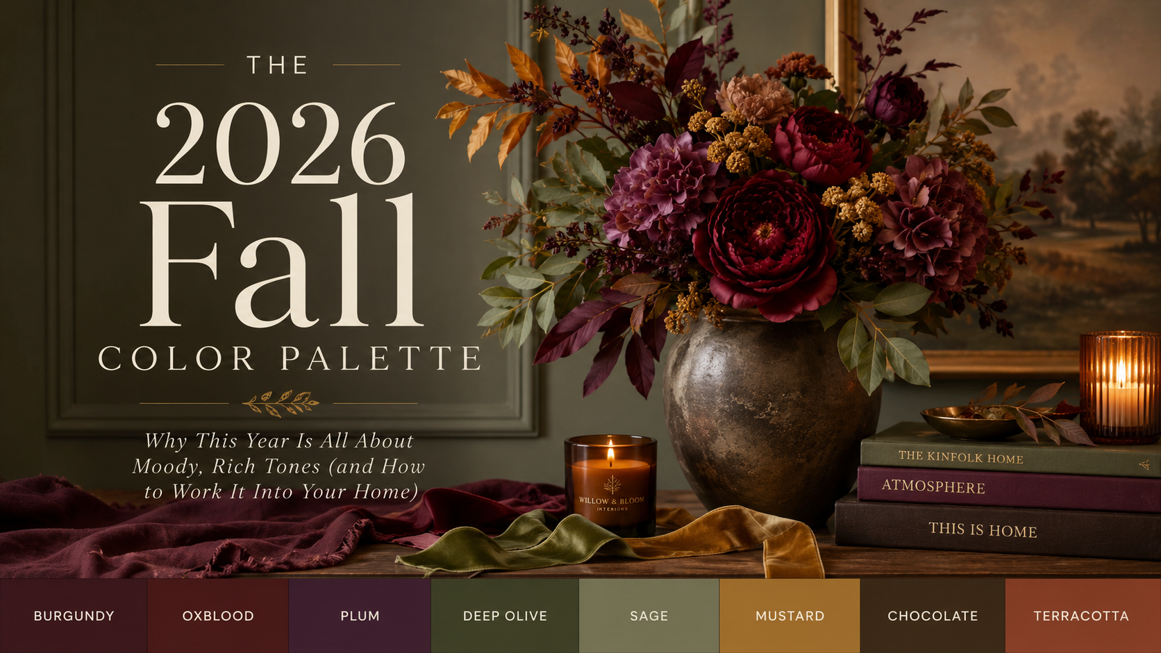
2026 is flipping that. This year’s fall palette is deep, moody, and a little dramatic — think burgundy, plum, chocolate, mustard, deep olive, and oxblood. It’s warmer, richer, and honestly a lot more fun to decorate with. If you love that “cozy but still elevated” look, this is the year to lean in.
Here’s what’s actually trending, why it works, and — most importantly — how to bring it into your home without redoing everything you own.
Why the Shift Toward Moody Tones?
Design trends this year are moving away from the flat, cool neutrals that have dominated for a while and toward color that feels grounded and collected — more antique shop, less big-box aisle. It’s the difference between a home that looks staged and a home that looks lived in and loved.
The good news for us floral and decor people? This palette is incredibly easy to build with faux greenery, ribbon, and florals — because so much of it already exists in nature. You’re not chasing a trendy paint color here. You’re working with tones that show up in oak leaves, wine grapes, dried florals, and autumn foliage. It feels earned, not gimmicky.
The Colors to Know for Fall 2026

Burgundy & Oxblood The new “neutral” of fall. Deep, wine-toned, and instantly cozy. This works beautifully as your anchor color in a wreath or arrangement — it reads rich without feeling heavy-handed.
Plum A softer, slightly more romantic cousin to burgundy. Plum tones pair gorgeously with sage or olive greenery for a look that feels a little more elevated and a little less “traditional fall.”
Deep Olive & Sage Olive has fully replaced the cooler eucalyptus-green we’ve leaned on for the last few seasons. It’s warmer, more grounded, and pairs with literally everything on this list.
Mustard Used sparingly, mustard is your pop of contrast. A little goes a long way — think one ribbon accent or a few small floral picks, not an entire arrangement.
Chocolate & Terracotta Your grounding neutrals this year. These replace the crisp whites and light woods that have felt popular in recent seasons, and they photograph beautifully against warm wood tones.
How to Style This Palette (Without Buying All New Everything)
Here’s the part I want you to actually feel confident about: you don’t need to start from scratch. This palette is one of the easiest to build gradually, because it layers so well with pieces you likely already have.
- Start with your base. If you have neutral wood tones, cream ribbon, or natural greenery already in your stash, those stay. They’re your foundation.
- Add one deep anchor color. Pick burgundy or plum, not both, for your first project. Let it be the star.
- Layer in warm greenery. Swap out any cooler-toned eucalyptus or fern for something in deep olive or sage — it instantly warms up the whole look.
- Use ribbon as your quickest color update. A single Farrisilk or seasonal ribbon in this year’s palette can transform an existing wreath or arrangement without you touching anything else.
- Add mustard last, and sparingly. This is your accent, not your base. One pick or a few inches of ribbon is plenty.
This is exactly the kind of “practical elegance” approach I love — small, intentional swaps that make a big visual difference, instead of overhauling your whole seasonal stash every single year.
Where to Start Shopping This Look
If you’re ready to start pulling pieces together, here’s where I’d begin:
- Faux greenery and stems in deep olive/sage tones
- Burgundy and plum florals & picks
- Seasonal ribbon in this year’s palette
- Mustard accent picks and berries
- Dough Bowl or Tray
A Few Ways to Use This Palette Around Your Home
- A front door wreath anchored in burgundy with olive greenery and a mustard ribbon accent
- A dough bowl or tray vignette layered with deep-toned faux pumpkins and warm greenery
- A mantel garland mixing plum and chocolate tones for something a little moodier than the usual orange-and-cream fall look
- Simple ribbon swaps on existing arrangements — the fastest, lowest-effort way to feel “on trend” without buying anything new
If you try any of these, I’d genuinely love to see it — tag me or send a photo. Half of my favorite project ideas come from what you all are creating.